
A little room to wonder
Colour & Contrast
Colour decisions involve hue, lightness and intensity. Contrast depends on relationships, the viewing conditions and what someone needs to recognise.
Why can two different colours still be difficult to tell apart?
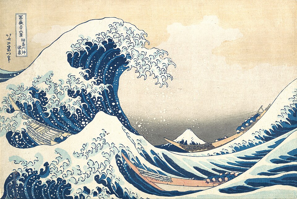
Separate three useful descriptions
Hue names a colour family, such as blue or yellow. Lightness describes how light or dark it appears. Saturation describes how vivid or muted it appears. Two areas can have different hues but similar lightness, so changing hue alone may do little to separate their shapes.
An artist can use strong differences to draw attention or small differences to make a quieter transition. Neither choice has one fixed emotional meaning for every viewer. Describe the visible relationship before claiming what a colour must make somebody feel.
Think about the medium
A screen sends out coloured light; paint changes the light reflected from a surface. Mixing coloured light and mixing pigments are different processes. The familiar red–yellow–blue paint wheel is a useful introductory model, not a promise that three particular tubes can reproduce every visible colour.
A colour also appears among other colours. A small patch surrounded by a dark area may stand out differently when placed on a pale area. Make comparisons in the intended setting rather than judging every swatch in isolation.
Worked example: an invented trail map
A fictional map uses a green line for the walking route and a red line for a closed route. The lines are the same thickness and carry no labels. Someone who cannot reliably distinguish those colours loses the main distinction.
A revision uses a solid line labelled “Open route” and a dashed line labelled “Closed route”, while keeping colour as an extra cue. The route information survives a black-and-white print and does not depend on remembering which colour means what. A separate lightness check still matters: labels that disappear against the background remain a problem.
A contrast check answers a limited question
Digital text contrast can be assessed using a defined luminance-ratio method. That measures a particular relationship between foreground and background; it does not certify every aspect of readability or accessibility. Tiny letters, unclear wording and crowded layout can still obstruct a reader.
Do not infer that somebody sees an image exactly as you do. Offer labels, shapes or patterns when colour carries information. In expressive art, these alternatives can also become part of the composition rather than an afterthought.
Only if you feel like trying
Keep the meaning without colour
- Design three imaginary map symbols and give each a colour plus a word, shape or pattern.
- Cover the colour names or describe the symbols aloud. Can you still explain their different meanings?
- Revise the weakest distinction and say what information now survives.
Optional. Work on paper, point to the example or talk it through. No account, purchase or public sharing is needed.
Look at the sources.
These references informed this introduction. You can check who published them, what evidence they use and whether you would ask another question.
- National Gallery of ArtThe Elements of Art: Color
- World Wide Web Consortium, Web Accessibility InitiativeUnderstanding Contrast (Minimum)
Research checked 1 November 2026. External pages have their own content and privacy practices.
Where could this connect?
These are editorial links between subjects. You choose which, if any, to follow.
Accessible Design
Information needs alternatives when colour alone cannot communicate it to every reader.
Follow this connection
Art
Colour is one of the relationships artists use to organise an image and guide attention.
Follow this connectionCharacters & Player Choices
Players need to recognise available actions; colour can support that recognition alongside shape and wording.
Follow this connection