
A little room to wonder
Composition & Balance
Composition organises a whole image. Balance concerns how its shapes, contrasts and spaces appear to hold together, rather than whether every side contains an identical object.
How can an uneven arrangement still feel balanced?
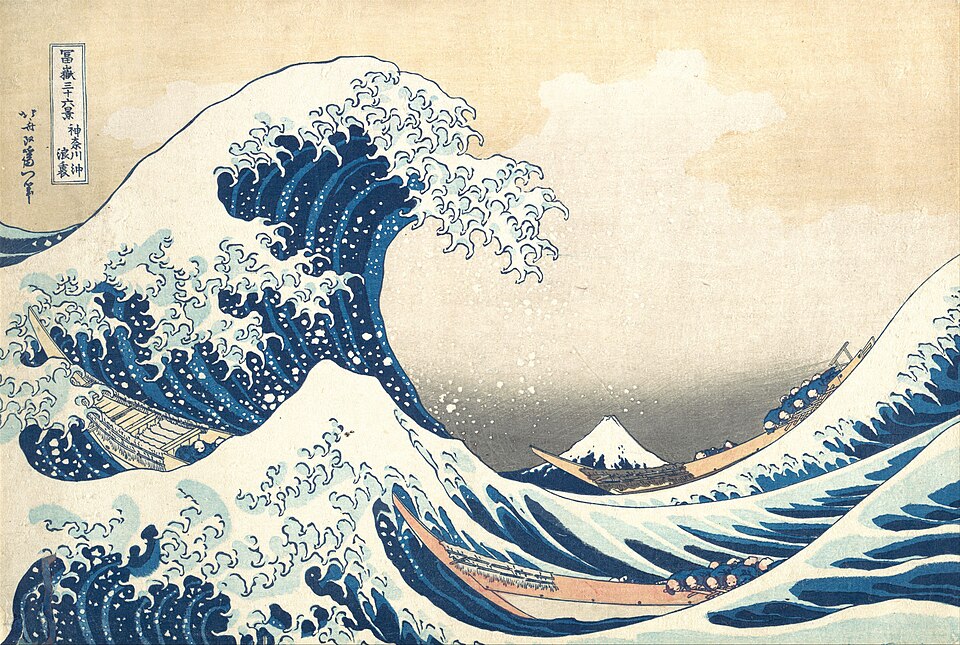
Arrange relationships across the whole image
Composition is the arrangement of parts within a picture. Size, position, direction and contrast influence which parts attract attention and how they relate. An empty area also matters: it can separate two groups, give a busy shape room or direct attention towards an edge.
Visual weight describes how strongly something seems to draw attention. It is not an object’s measured mass. A small dark shape on a pale background can command attention without occupying much area.
Compare different kinds of balance
Symmetrical arrangements broadly mirror forms across an axis. Asymmetrical arrangements can balance different forms without mirroring them. Radial arrangements organise forms around a centre. These are useful descriptions, not a ranking of good and bad art.
Balance is not the same as emphasis. A composition can hold together while giving one feature much more attention. Repeating every shape equally may remove the focal point rather than improve the work.
Worked example: one circle and three squares
An invented poster has a large dark circle near its left edge and three small pale squares tightly grouped beside it. The right half is empty. Simply adding three more pale squares to the same cluster increases the imbalance in position.
One revision moves the small squares to the right, increases their contrast and gives them more separation. This offers a different counterweight to the circle. There is no equation proving the result; comparing the two whole arrangements provides a reasoned visual judgement.
Change one relationship before adding detail
An uneven arrangement may be deliberate: it can make an image feel poised or unsettled. State the intended effect before judging whether the choice works. “The right side is empty” is an observation; “therefore it is wrong” requires a purpose.
A thumbnail removes distracting detail and exposes large shapes. Compare several small arrangements before polishing one. Keep the same content so you can explain whether position, scale or contrast caused the difference.
Only if you feel like trying
Compare two compositions.
- Draw a rectangle, one large circle and three small squares. Try two arrangements using the same shapes.
- Label the intended focal point and one useful empty space in each version.
- Change only position or contrast, then explain which whole arrangement better serves your chosen purpose.
Optional. Use the supplied fictional example, pencil and paper, or explain your choices aloud. No personal story, account, purchase, public sharing or contact is needed.
Look at the sources.
These references offer further reading on the ideas here. Check who published them, what they support and what you would ask next.
- J. Paul Getty MuseumPrinciples of Design
Research checked 1 November 2026. External pages have their own content and privacy practices.
Where could this connect?
These are editorial links between subjects. You choose which, if any, to follow.
Art
Composition connects individual artistic choices into a deliberate whole.
Follow this connection
Musical Form & Structure
An arrangement of repeated and contrasting musical sections offers a time-based comparison with visual organisation.
Follow this connectionTypography & Layout
A page also balances large headings, small text and empty space to guide attention.
Follow this connection