
A little room to wonder
Texture & Mark-making
Marks can depict a surface without reproducing its physical feel. Direction, spacing and layering help distinguish a visual texture from the material carrying it.
How can a smooth sheet suggest several different surfaces?
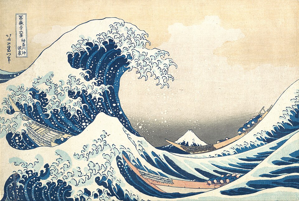
Distinguish surface from depiction
Actual texture belongs to a surface that could be felt, such as the raised weave of cloth. Visual texture is a pattern of marks that suggests a quality such as roughness or smoothness. A printed photograph of a rough wall can itself be smooth.
Mark-making means choosing how a tool leaves traces. Dots, dashes, loops and broad strokes have different edges and rhythms. Naming the marks precisely is more useful than calling every busy patch “rough”.
Change a variable you can describe
Hatching builds tone with lines; cross-hatching adds another direction. Stippling uses dots. Closer marks often make an area appear darker when viewed from farther away. The material and contrast still affect the result, so identical counts do not guarantee identical appearances.
Direction can follow a form. Curving marks around an invented cylinder may help suggest its rounded surface, while unrelated straight marks can flatten or interrupt that suggestion. Texture can describe form and also create an expressive pattern.
Worked example: three fictional swatches
An invented study has three equal squares. A contains twelve widely spaced vertical strokes, B twelve closely grouped strokes in one corner, and C twelve strokes spread evenly in two crossing directions. Each uses the same total number of marks.
A is relatively open; B creates a dark local cluster and a larger blank area; C introduces a crossing pattern. Counting twelve marks does not make the three textures equivalent. Their distribution explains the visible difference more clearly than the total alone.
A picture does not prove a material
Shiny-looking highlights may suggest polished metal, wet stone or a fictional surface. They are cues, not a laboratory test. Do not infer the actual material from one drawing without other evidence.
A texture study need not imitate an object. It can explore contrasts between regular and irregular marks. Keep that purpose clear so a decorative pattern is not presented as a measured observation.
Only if you feel like trying
Build a three-swatch texture study.
- Draw three equal squares and place twelve marks in each. Change spacing, direction or grouping, one choice at a time.
- Describe each result using visible features such as dense, open, crossing or curved.
- Choose a fictional surface and explain which swatch could suggest it, without claiming the paper has become that material.
Optional. Use the supplied fictional example, pencil and paper, or explain your choices aloud. No personal story, account, purchase, public sharing or contact is needed.
Look at the sources.
These references offer further reading on the ideas here. Check who published them, what they support and what you would ask next.
- National Gallery of ArtThe Elements of Art: Texture
Research checked 1 November 2026. External pages have their own content and privacy practices.
Where could this connect?
These are editorial links between subjects. You choose which, if any, to follow.
Art
Texture gives artists another relationship to control alongside shape, line and tone.
Follow this connection
Drawing & Observation
Observational drawing distinguishes a visible surface cue from an assumption about the object.
Follow this connectionPixels & Digital Images
Digital images also form visible textures by arranging small units across a surface.
Follow this connection